Application Builder

General Description
The ZDMP Application Builder, also known as zStudio, supports developers with a UI aiming to define, design, develop, and compose zApps and manufacturing services. The primary purpose of this task is to facilitate the development process of zApps by providing a design time environment for their production including behaviours and UI elements. The frontend elements can be used in all Assets (zApps and potentially ZDMP components) where possible, but it is not mandatory if there is a good technical or aesthetic reason not to do so.
The zStudio consists of a frontend environment available for developers to create an initial structure of zApps and services. Along with the frontend, it includes a Service Backend, which offers methods to access functionalities of all technical components that the service developers need, such as messaging, storage, service provision, service use, workflow execution, and easy integration of data from various sources. The Service Backend contains an extensive, fully documented API framework that provides developers with the means to interact and use the APIs provided by other ZDMP components. The Application Builder includes programming tools to provide value-added service compositions.
The basis for the development of the Application Builder is to provide a framework of elements that support the development of services and zApps for ZDMP. The Application Builder provides an UI editor for zApps to the developers. This enables the drag-and-drop elements to embed the resources and services that a zApp requires, as well as to access design orientated data stored in ZDMP (models, patterns, and behaviours).
The Frontend Environment provides a common behaviour for UI elements to developers. To enable this, a relevant set of UI elements with pre-defined business logic is included in the component. The Frontend Environment is the primary actor to simplify UI dependency management, eg, a login/registration form with underlying business logic to communicate with the platform for user management; a bug reporter, which enables users to report any technical issues related to ZDMP to the zApp developer; a translation tool for users to translate zApps and services into other languages.
| Resource | Location |
|---|---|
| Source Code | Link |
| Latest Release | Vs 1.0.0 |
| X Open API Spec | None |
| Video | Link |
| Further Guidance | None |
| Related Datasets | None |
| Additional Links | None |
| Generation date of this component | 2020-12-08 |
Screenshots
The following images are illustrative screenshots of the component.
Component Author(s)
| Company Name | ZDMP Acronym | Website | Logo |
|---|---|---|---|
| Ascora GmbH | ASC | www.ascora.de |  |
Commercial Information
| Resource | Location |
|---|---|
| IPR Link | Link |
| Price | [For determination at end of project] |
| Licence | [For determination at end of project] |
| Privacy Policy | [For determination at end of project] |
| Volume license | [For determination at end of project] |
Architecture Diagram
The following diagram shows the position of this component in the ZDMP architecture.
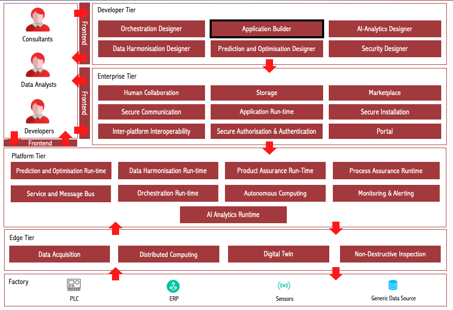
Figure 1: Position of Application Builder Component in ZDMP Architecture
Benefits
The benefits are:
Help developers to create a zApp using UI components, which can be added with a single click
UI components are linked to ZDMP services through APIs
UI components are linked to other ZDMP components, including message bus, Monitoring and Alerting, storage, authorization, authentication, and Marketplace
zStudio ensures that certain basic functionalities which every zApp requires, such as notifications, dashboards etc, are available in a standardized manner to all zApp developers
A zApp with a specific industrial use case can be quickly created with readymade components, which are hooked to a ZDMP application
Features
Application Builder offers the following features:
zApp Creation
User Authorization and Authentication
Error Reporting
Multi Language Support
Application Logging
Notification Template
Automatic Updates
Telemetry service
zApp packaging
Receiving data from message bus
Chart/Graph representation of message bus data
Sending data to message bus topics
Sending alerts using Monitoring and Alerting
Exporting a Docker image of a zApp
Upload a zApp’s docker image to human collaboration
zApp Creation
The Application Builder enables developers to create a fully functional zApp and then upload it to the Secure Business Cloud. After this process, the new zApp can be delivered to clients / users. The zApp template created by the Application Builder is expected to make development easier and faster. Even if in most cases adaptation and extensions have to be implemented to create more than basic applications, the provided examples demonstrate how to use the APIs and components used within ZDMP and should make a quick and intuitive starting point for developers.
A zApp is composed of following UI elements and templates:
UI elements: Various UI elements are provided in the zStudio to be used by developers. These elements come as defaults but are also customizable for its respective purpose. These range from charts and diagrams which can be data-bound to ZDMP services (zAssets), through to an “About” page with information and informative links
UI templates: The zStudio provides UI templates which are precomposed compositions of UI elements from the UI Element Repository. Each template appears as a single UI element but is composed of several UI predefined elements. A lightweight example of a UI template is a login form, which is composed of a grid, textbox, password-textbox, and buttons
Behaviour elements: Behaviour elements provide default behaviours for activities, which are related to UI interactions. Those behaviours are easy to integrate and applicable for, eg forms, downloads, registration, notifications etc
Behaviour templates: Behaviour templates consist of sequenced behaviours that are processed synchronously. These behaviours ease the use of handling events and support developers with additional default events
Holistic templates: Holistic templates provided by zStudio unite UI templates and behaviour templates. These templates include logic to manage user interactions automatically, eg a zApp template which already includes error management, contact forms with default mail templates etc
User Authorization and Authentication
The user can register or login to ZDMP with this function easily. A UI is provided with a connection to the Security component, which manages the registration and login process. For registration, the user enters a valid email address, first name and last name. The Security component then takes over and replies with a confirmation email to the entered email address, as double-opt-in confirmation by the email is necessary to comply with the GDPR. In the case of a login, only the user credentials (username and password) are necessary. Again, the Security component takes over for the verification of the credentials and responds with granted or denied access.
Error Reporting
Where errors in ZDMP Assets are recognised and for troubleshooting reasons, reports are forwarded to the administration area of the Secure Business Cloud. There, developers can examine the error reports to react quickly with bug fixes. Error reports consist of information about the sender, client operating system, application, time, and the error itself (eg exception stack trace).
Multi Language Support
Internationalization is a major feature which every zApp may need to support. With the Multi Language Support feature, a user can switch languages in any zApp. In addition, a resource editor (translator) is provided, which shows in a default language file (English) all strings which can be translated into the language the user speaks or be switched to any language that is already provided. This translation does not happen in the application, so only the language file is needed to do a translation. After translation has been performed, the user can request to add the translation to the official application. Then it depends on the developer if the new translation is accepted or declined.
Application Logging
Logging is a default debugging mechanism used during the development of a zApp as well as at runtime for bug-fixing. With this, internal processes are logged and saved to an additional logfile. This file then can give the developer hints about possible error messages and eases troubleshooting. Information of the log can be displayed in the client application.
Notification Template
Through this feature, developers can provide the functionality to raise notifications to make users aware of relevant information, depending on the user management system of the ZDMP Security component. The idea is to enable developers to quickly integrate the API without having to care about user management, access rights and the targeted presentation of the notifications in the client applications of the factory workers etc, which should reduce time to enable these kinds of features by at least 50 %.
Automatic Updates
This is a mechanism used to maintain zApps after development and upload to the Marketplace. This feature provides functionality of automatically updating zApps after a new version was created for release, for example when bug fixes or new features were implemented by the zApp developer. Having a standard way to enable updating is a basic feature of all mobile Marketplaces, as this takes away the setup of the necessary infrastructure and enables a common user experience between different zApps.
Telemetry service
The Telemetry service is a part of Application Builder which provides usage information of a zApp. A web base UI for the visualization of data in charts and views provided by the telemetry-service is also available. Such integration is necessary for real world software vendors as it allows gathering insights for 3rd party developers on how their applications are used. Having the combination of client and server-side implementation fixed allows ZDMP to offer common insight dashboards on common usage metrics.
zApp Packaging
A zApp package consists of source code, a manifest file, a docker image and deployment files. The zStudio generates the following pieces for the developer:
Source code: Source code of a zApp. These source files are generated by the Application Builder as a first step: it builds a code skeleton - a template of basic functionality. Afterwards, the zApp developer can expand this basic code structure so that the zApp fulfils the required function
Manifest file: Mark-up file with extra properties/metadata of the zApp. The initial template is generated by the Application Builder, but the developer has to complete it
Docker image: When running the zStudio, a docker image can be exported by clicking on the button “Export Docker”
Receiving data from message bus
The zStudio enables users to subscribe to message bus topics. From the list of all available topics, users can select a topic they want to receive data from. Each time any data is published to that topic, the users receive data which they can use, eg to display it in the form of graphs or plain data. To stop receiving data, the zStudio provides a possibility to unsubscribe from any topic from the available list of topics.
Chart/Graph representation of message bus data
Data coming from the message bus can be represented using bar charts. These charts are linked to the specific topic and monitor a default value. Both the topic and the value to be monitored can be customised by editing the code generated by the chart. Multiple charts can be used to monitor multiple values coming to a topic. For developers, seeing the data represented in a chart is an intuitive example of how to work with the chart/graph APIs provided.
Sending data to message bus topics
A user can send messages to a topic manually. The zStudio provides a UI element which consists of a list of available topics and a text box for messages. A user can select a topic from the list and type message which they want to send. Everyone who has subscribed to that specific topic can receive the data sent from zStudio. This UI element is a quick way to validate that the message bus is correctly connected and also a good way to start for a developer who wishes to access the message bus with their own code.
Sending alerts using Monitoring and Alerting
The zStudio shows how to monitor data coming from message bus by providing an UI element which lets users to enter a topic name and a value to monitor. The users can also provide multiple emails where they want to send alerts in case a certain value goes out of range.
The zStudio simplifies Monitoring and Alerting integration for the user. In the backend, zStudio creates a KPI, a condition and alerts using Monitoring and Alerting component, which are used to inform users if a value goes out of range.
Docker image export of zApp
The docker image of a zApp is needed to deploy the zApp into the application runtime component. When running the zStudio, a docker image can be exported by clicking on the button labelled “Export Docker”. The zStudio create then docker image. The backend executes a docker build -command and thereafter exports the created image as a download in the browser.
Upload a zApp’s docker image to Human Collaboration Environment (GitLab)
The generated docker image can be pushed to the Human Collaboration Environment (GitLab) from where it can be fetched by the application runtime. Furthermore, the link to the docker image is also x defined in the manifest file required by the Marketplace. This link is used by secure installation to deploy the zApp in the application runtime.
Sign into the Portal and access other ZDMP components
The Portal component is integrated to the Application Builder through the Dash Button, which is located in the upper right corner of the UI. The Dash Button allows a user to sign in to the ZDMP Portal, and thus, access other ZDMP components. The Dash Button also offers the option to register a new account if that action has not been conducted yet.
System Requirements
Minimal requirements needed:
Virtual machine’s cluster formed by at least 1 machine with 1VPC, 4GB RAM and 20GB of disk, expecting to store the actual software docker images in the Storage component
Docker
Associated ZDMP services
Required
Optional
Installation
Code Structure
The main folders in the development project file structure are:
Documentation: This folder contains a set of .md files describing the Application Builder. It contains this deployment documentation, along with the Application Builder Guide explaining how to use it for designing frontend of ZDMP assets
Orchestration: This folder contains a set a Docker-compose .yaml file which orchestrates the Application Builder
Subsystems/zdmp-application-builder: This folder contains the Application Builder’s source code, developed with the framework Angular. It also contains “basic_apps” folder consisting of a sample zApp. Further apps created by developers are stored in the output folder
Docker Compose
For running the Application Builder component process, run Docker-compose which is provided in the Application Builder code. Docker-compose allows deploying a set of Docker services using one or more Docker files.
For running the Application Builder’s Docker-compose, in the root folder of the project run the following command:
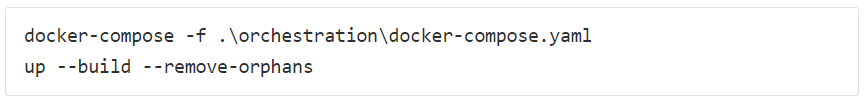
Figure 2: Docker-compose commands
The command builds the images and run the services specified in the different Docker files.
How to use
Please note that the intended audience for the Application Builder / zStudio are developers. The descriptions in this section might not be easily understood for non-developers.
The “How to use” part of this document gives an overview of the different components of Application Builder and demonstrate building a sample zApp to showcase the use of Application Builder to build zApps.
Initial view of Application Builder
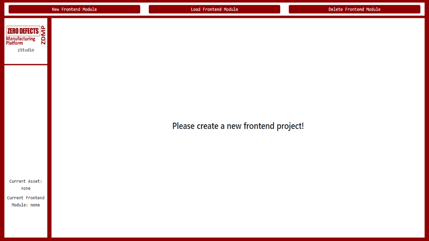
Figure 3 shows the first screen which is displayed when the user starts zStudio. On the top menu bar, there are three buttons which are used to create new, load and delete exiting modules/zApps. New Frontend Module (1) allows user to create a new zApp, whereas Load Frontend Module (2) loads an existing application from the already created apps which can be further modified after being loaded. If a module is no longer needed, it can be deleted using Delete Frontend Module (3) button.
On the left side, the Current workspace (5) is presented. Within the ZDMP environment, this represents the name of the actual asset, delivered from the zStudio. Once the user has decided for an zApp name, they can see it as well within the Current Frontend Module (6) panel. Those panels, as well as access to the other windows, become visible on the Menubar (7), after an application has been created.
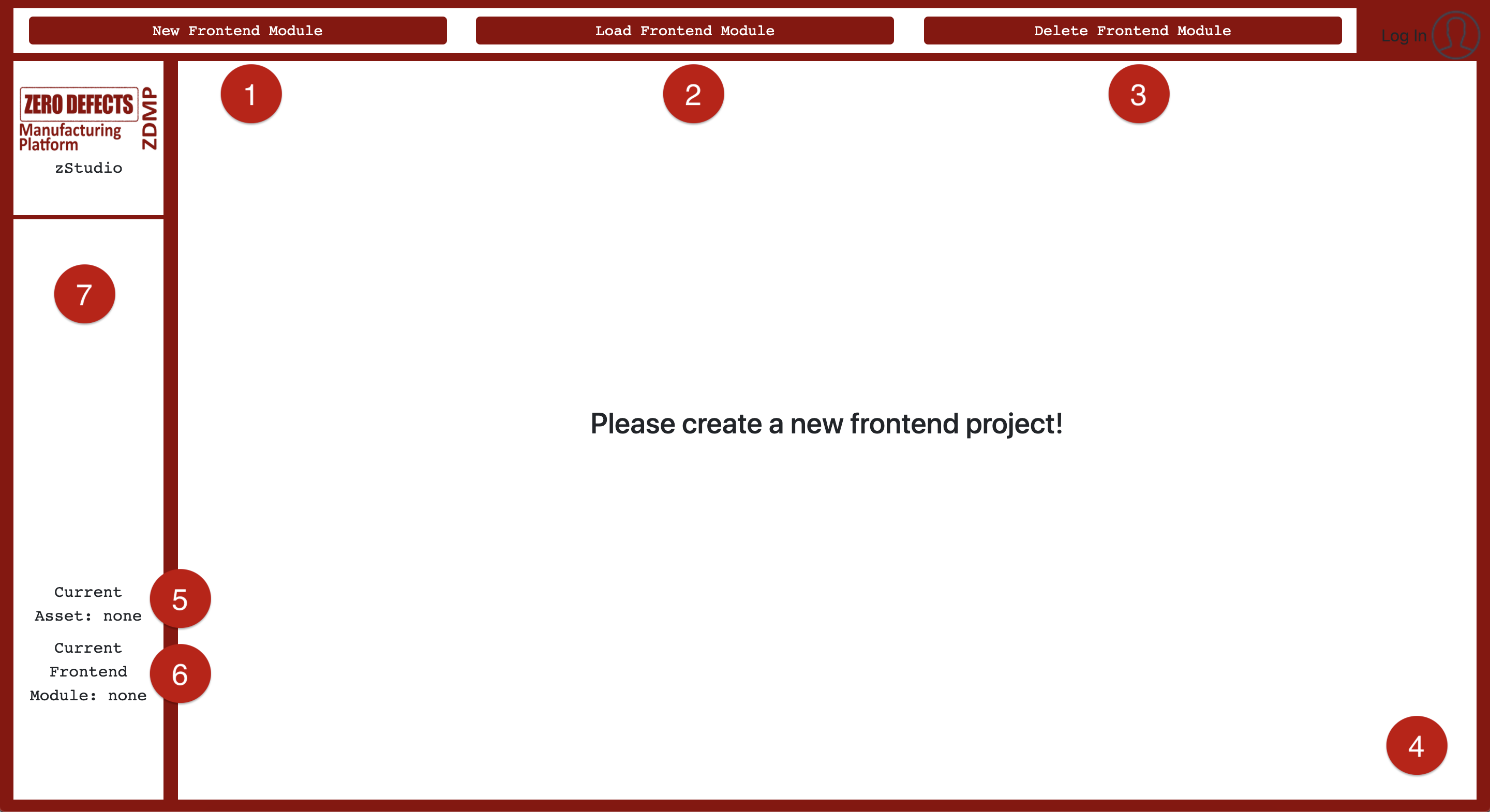
Figure 3: Application Builder - Module Management
Menu bar and sub-components
The developer can access all the sub-components of the Application Builder from the menu on the left (Figure 4), originally starting from the Prototyping (8) view. This view is the one where zApp developers are designing and building their solutions, especially the UI. The second one, Translations (9) is used to take care of internationalization aspects of the zApp. In case the building process of the application causes errors or developers wish to have information about the build in general, the Log (10) view can be accessed.
The current workspace is also shown, as well as the Build (14) button, which can be clicked once the developer wishes to update the current zApp with the latest changes. The configuration (15) view is used to declare manifest data, deployment configurations, and to upload zApp to the Marketplace. If the application is finished and ready for publishing within a Docker-environment, extracting the Docker image can be achieved with Export Docker (16) button. The following sub-sections dig deeper into all the views presented in the menu bar.
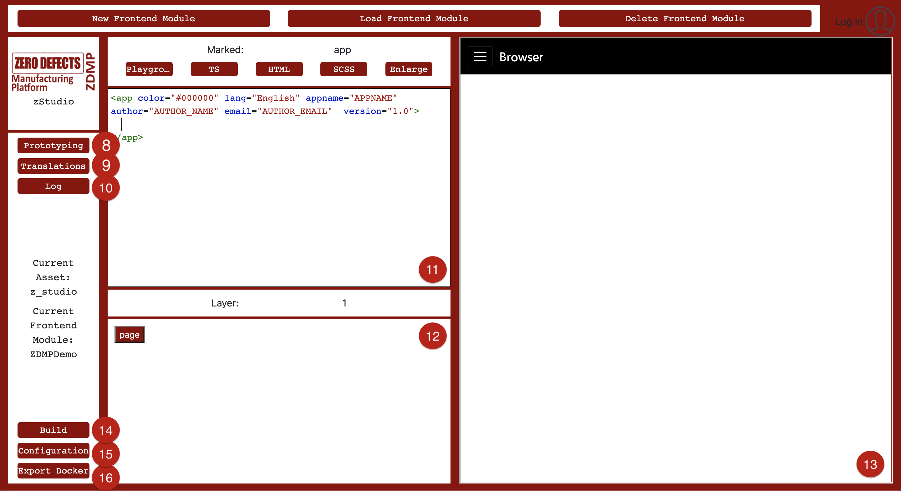
Figure 4: zStudio’s Menu bar and sub-components
Prototyping
The prototyping view is the main view and the most important part of the Application Builder. A user can add pages to the newly created zApp and add further UI elements to the pages. The same view is used to create new zApps and edit existing ones. Next to the page navigation in Figure 4, there is an XML-based layout structure (11), showing in an understandable way which elements are included in the zApp. UI elements can be added to the XML view by clicking an item in the template view (12). The results of every template-click and the build is presented in a clickable preview layer (13).
The contents of the template view (12), which is used to add items in the zApp, depends on the current stage of application. For example, an zApp with no content only displays options to add pages, whereas inside the page it allows adding elements to the page. When one of the elements in a page is selected, the template view offers options to change the attributes of this element.
Different layers in the template view could be understood as different depth levels of the zApp. The first layer 0 gives a backbone to the whole zApp with global configuration and settings. It is created by default with a new zApp as it is always required. Layer 1 will take care of dividing the zApp into pages and the navigation between each page. On the other hand, users can also create global components here, which have self-enclosed functionalities, such as the main menu for zApp navigation, or a bug-reporter in case of an error taking place. Layer 2 and even deeper nested layers define how to fill the pages of layer 1.
When the user clicks on the template just rendered in the layout structure, it gets marked and a new display is visible: Instead of the layer- and template view (12+19), the developer now is able to get deeper into the marked element by showing its name (19) and attributes linked to it in an attribute view (20). Every individual template has its own set of attributes to set and manipulate. As with the templates, experienced developers can rewrite attributes in the layout view itself, or just change them by clicking around the possible options (Figure 5).
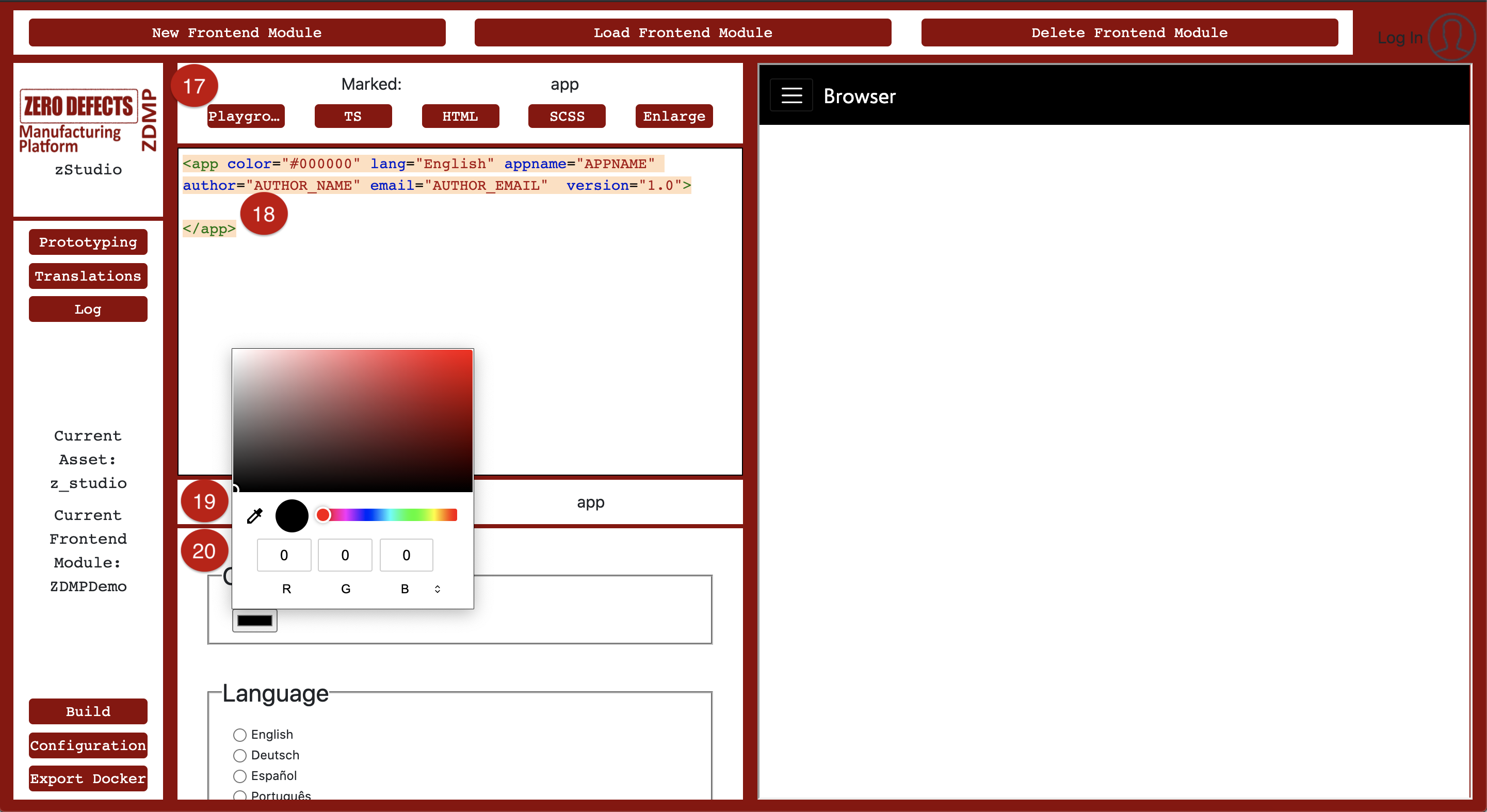
Figure 5: Creating the first zApp
Translations
Lingual inputs, such as the zApp name, page name or panels, are definable by the users themselves. This happens with a key-value-concept (Figure 6). In this example, the zApp name is associated to the key “APPNAME”. A switch to the translation view must be made to define that. Having a look at the view in question, a table can be seen with multiple columns. The first column is for the ID of the lingual entry and the following ones are for counterparts of this key in different languages.
There are already several language key-value inputs (21) defined for some terms, such as the “APPNAME”, or page names (“HOME”, “TEST”).
If users need additional translations, they can insert values in key-value inputs (21) and confirm the done work with submitting the translation (23). After the server saves it, the translation will automatically be added to the default list already shown, and it becomes selectable in the prototype view.
Of course, translations that are not needed any longer can be deleted (24). Scrolling to the right, existing entries can also be selected (22). Their current translations will be then inserted into the input fields, allowing their modification and resubmission.
If users wish to submit a new language (25) to be translated, they need to insert the name of the language and submit it by pressing the respective button. Every key needed will be copied, assigned with a default placeholder as a translation and saved. The developer can thereafter assign all translation values to the new translation.
From the zApp menu, language can be switched, and this switch uses entries inserted by developers in the translation table.
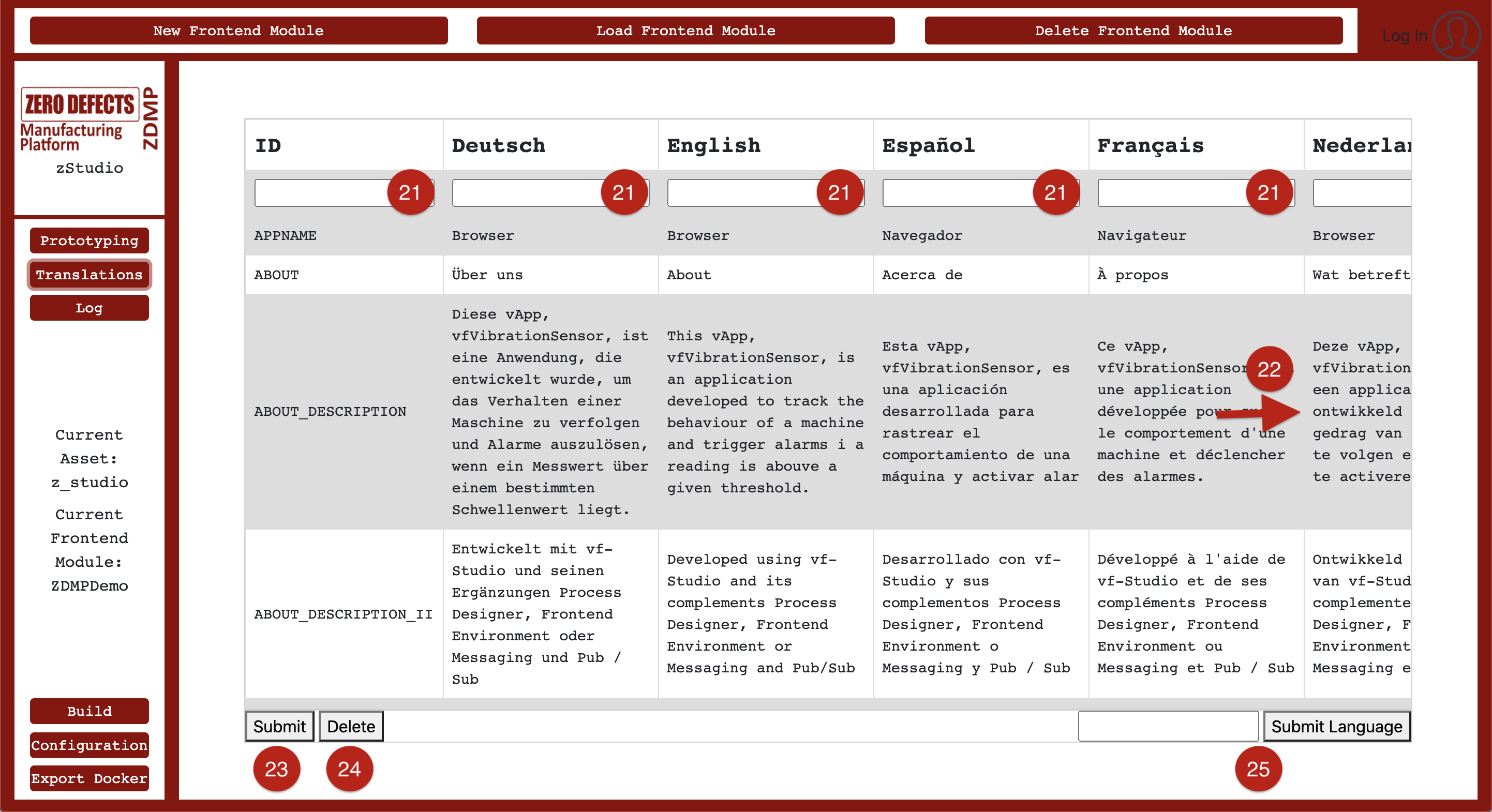
Figure 6: zStudio’s Translation View
Log
Whilst developing an application, it is common to face issues and get errors. In this case, the build process fails, and the preview shows an error message instead of elements of the zApp, added by the developer. To find out the exact reason for the problem that occurred and to debug it, the developer can see the log section for more information (Figure 7).
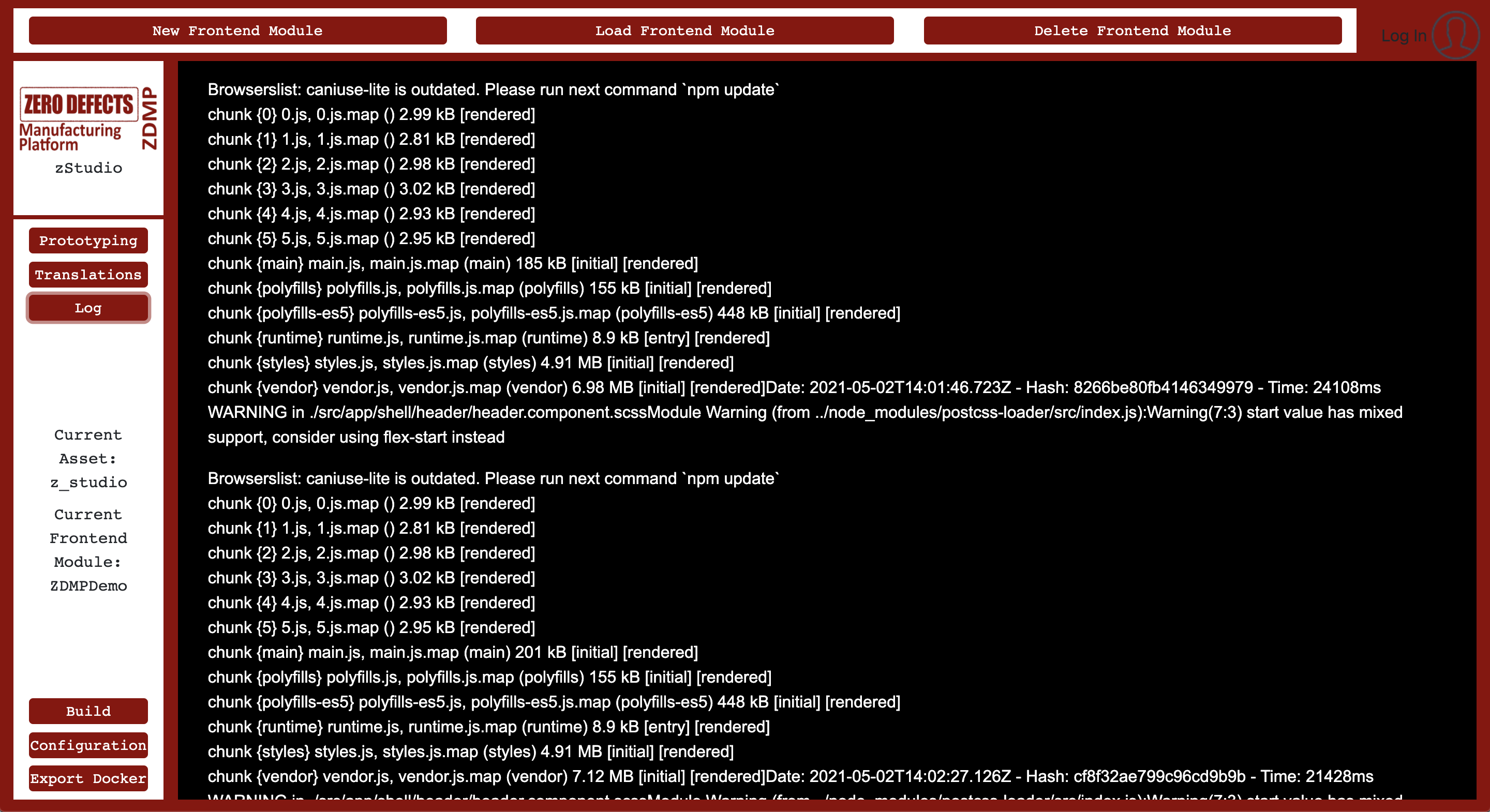
Figure 7: Log-View
Build
After adding UI elements to the zApp, changing attributes of UI elements, or manually editing the code, a user has to build the zApp to see these modifications in the preview layer. To update the changes into the zApp preview, click the Build (14) (Figure 4) button. The frontend now sends a task to the server to build the scaffolding of an updated zApp template. Once finished, the server answers and fills the empty preview layer (13) with an updated zApp.
Configuration
The Configuration (15) view, shown in Figure 8, gives an opportunity for developers to push their zApp to the Marketplace. All the zApps, which developers wish to make available to users, have to be on the Marketplace, from where users can download, install, and use the zApp. This view provides three sub-views, including ‘Manifest file’ to configure manifest data (Figure 9), ‘Deployment configuration’ to configure deployment parameters and ‘Upload to Marketplace’ button to upload the zApp to the Marketplace. Both Manifest and Deployment configuration files are required by the Marketplace along with a docker image of the zApp.
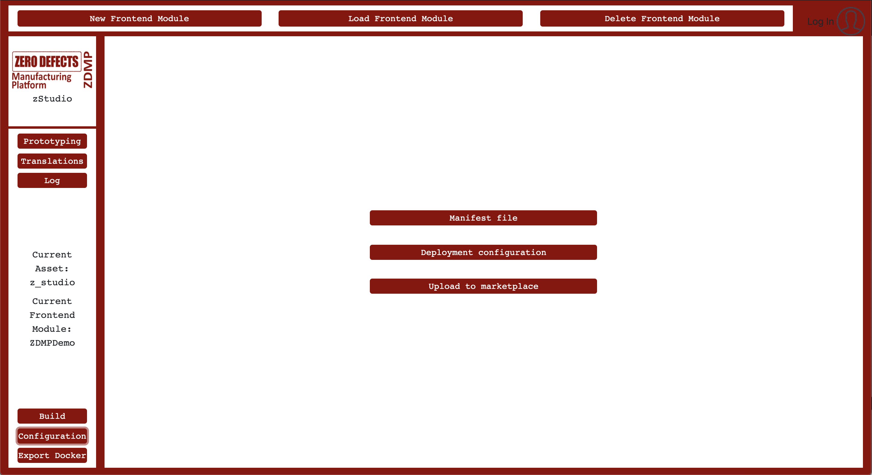
Figure 8: Configuration-View
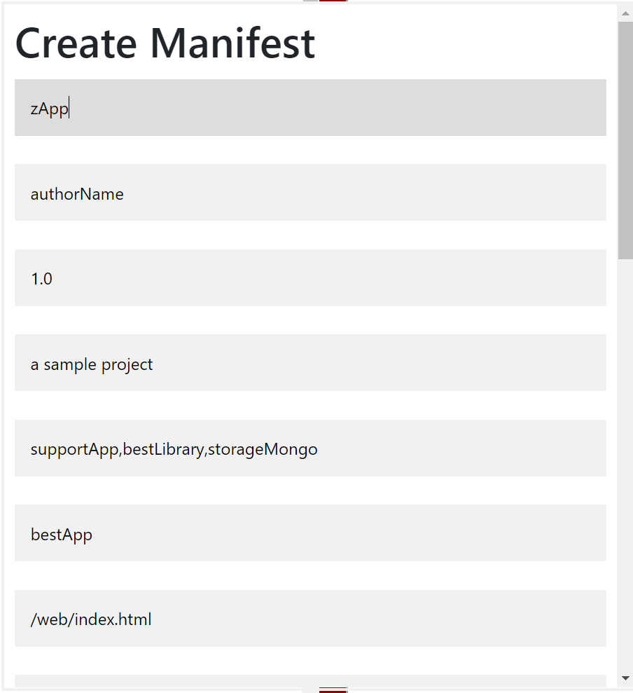
Figure 9: Manifest-View
Export docker
Once the zApp is ready, it can be exported locally as a docker image using Export Docker (16) button shown in Figure 4. This docker image can also be pushed to the human collaboration component to be used by other components, including secure installation, and Marketplace.
Overview of UI elements available in Application Builder
On different abstraction layers of the zApp, different UI elements are available. Following is a brief description of the UI elements zStudio provides:
Page
Simple pages can be added inside the main zApp. The <app> tag at layer 0 already exists by default (Figure 10) when a new application is created, however, the user has to add layer 1 (eg pages) and layer 2 (UI elements inside pages). To add a page, the user has to be inside the <app> tag in XML view, then click on page (26), and build the zApp to get the page added to the zApp. If there are multiple pages, the user can move between them from the main menu bar of the zApp. Pages can also be linked to UI elements and, for example, one can move from page to another with a button click.
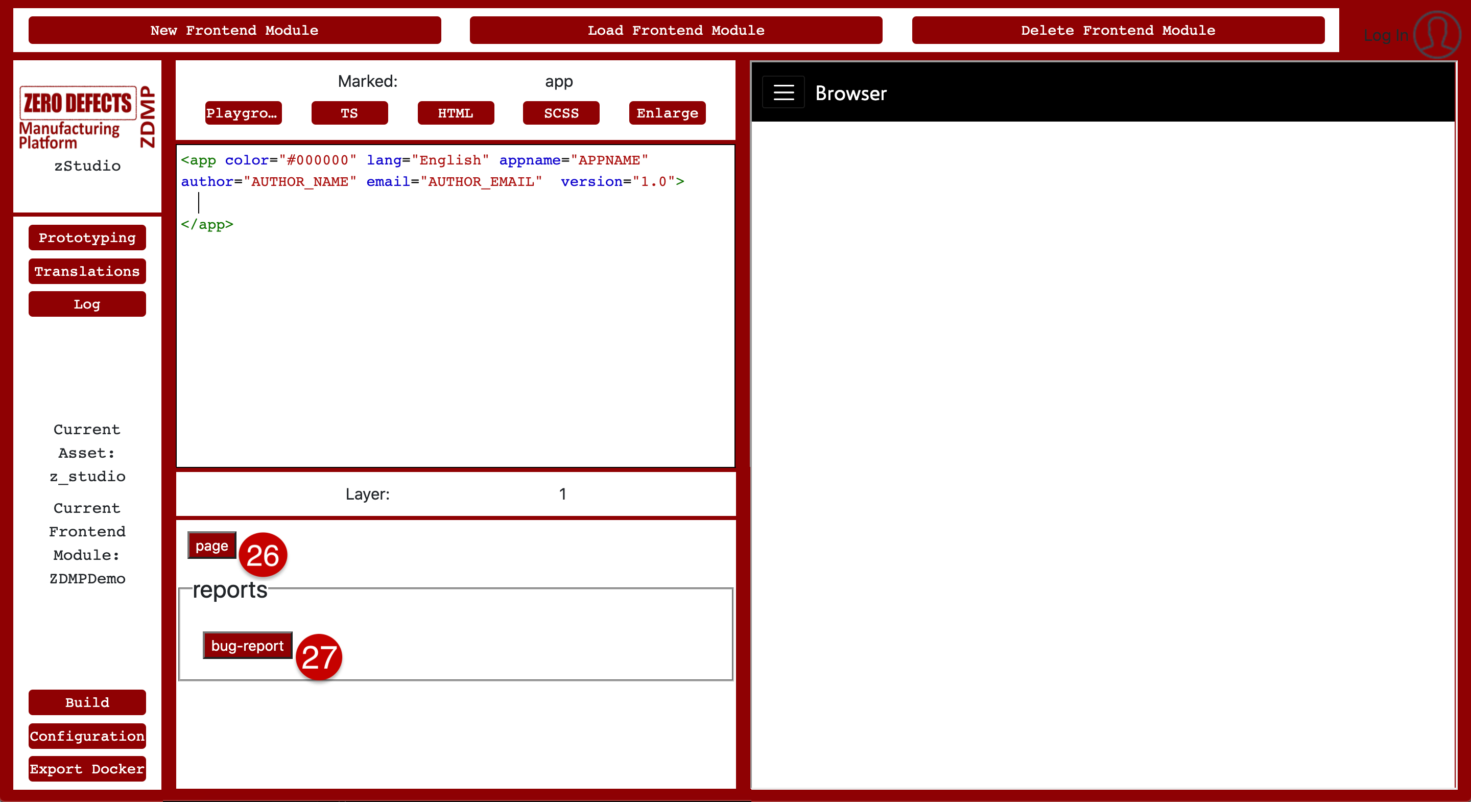
Figure 10: UI elements – page and bug-report
Reports
Layer 1 also has another UI element, bug-report (27) (Figure 10), which can be used to send error reports to the developers. These bug reports include error messages and the stack trace of the bug, which can help developers to debug the code, remove errors, and update the zApp accordingly.
Common UI elements
Inside pages, further UI elements can be added. These are divided into different categories based on their usage. In Figure 11, common-UI-elements (28) are shown. These include buttons, a clock, notifications, and a separator, etc. Any of these elements can be added by clicking on the respective button in the template view. After adding a UI element, the zApp has to be built to see the changes in preview.
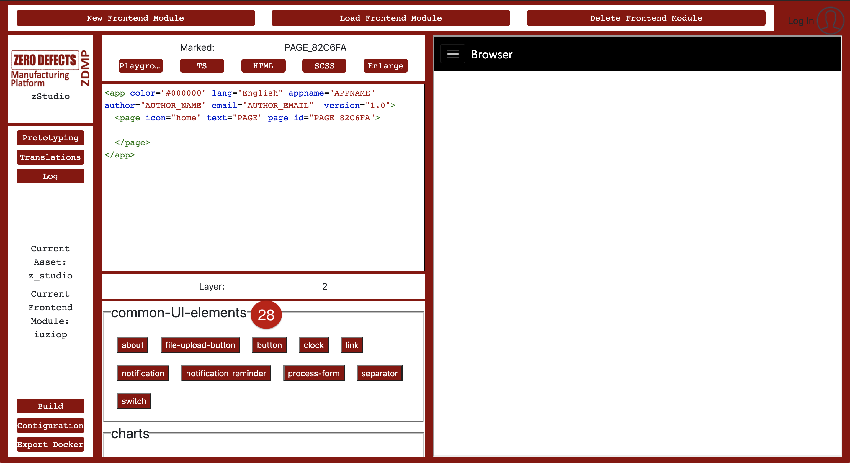
Figure 11: Common UI elements
For example, if users add a button and click on the build button, they would be able to see the newly added button in the zApp as shown in Figure 12. Some UI elements have additional attributes. For instance, a button has a ‘text’ attribute on it. When the button is selected in the XML view, the template view displays attributes of the button, which can be directly changed from there (Figure 12). The zApp has to be built again after changing the attribute.
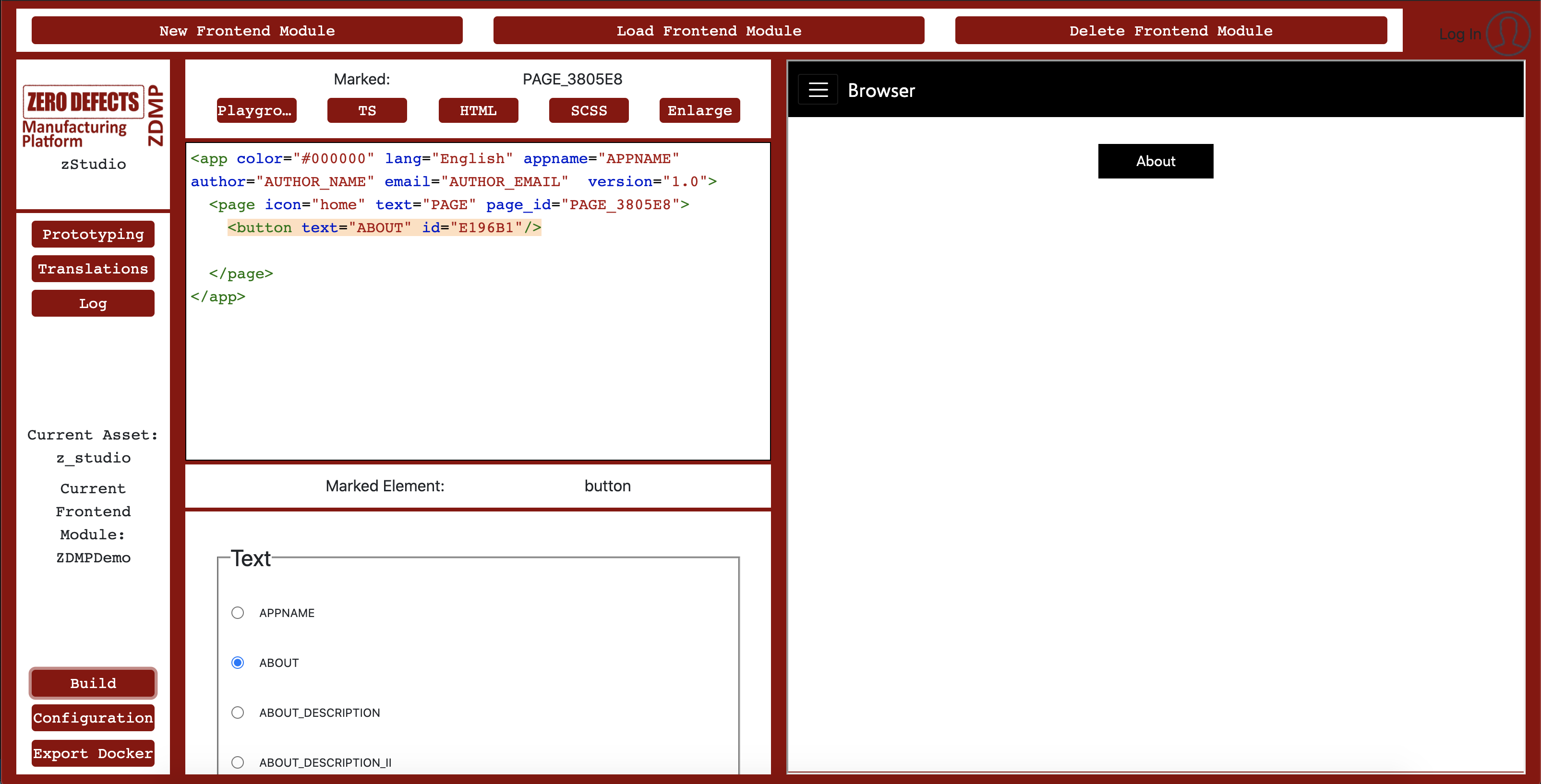
Figure 12: Button added to the zApp
Charts
This section consists of multiple types of charts (29), including (but not limited to) an area-chart, a bar chart, a heatmap, a pie chart, and a polar chart. These charts use data stored in a file in JSON format. From the attribute view of the charts, the data source can be adjusted to point to a specific source file. Figure 13 shows a single-page zApp with a bar chart in it:
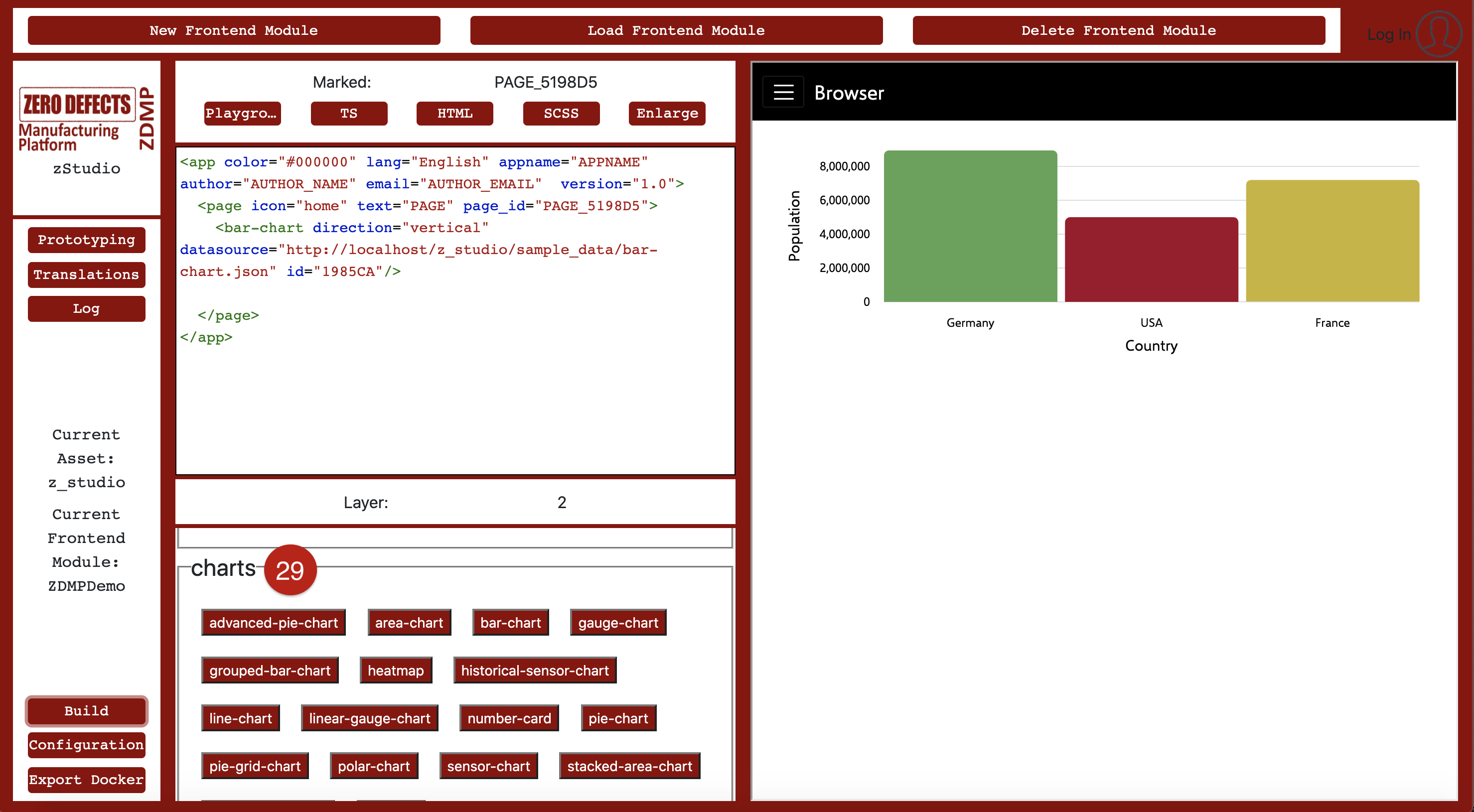
Figure 13: UI elements – charts
AI Analytics
The AI-analytics (30) (Figure 14) element enables the prototypical integration of the ZDMP AI-Runtime. A user can send values to already trained AI models and get back the result. The desired model can be given as an attribute to the element by clicking on the <ai-analytics> tag in XML view. The result received is then displayed in the form of a table.
Media
UI elements in the media (31) section allows users to add audio, images, and videos to their zApp. They all require a source attribute, which points to an audio, image, or video file to be used as the source file. Figure 14 shows an audio file added to the zApp.
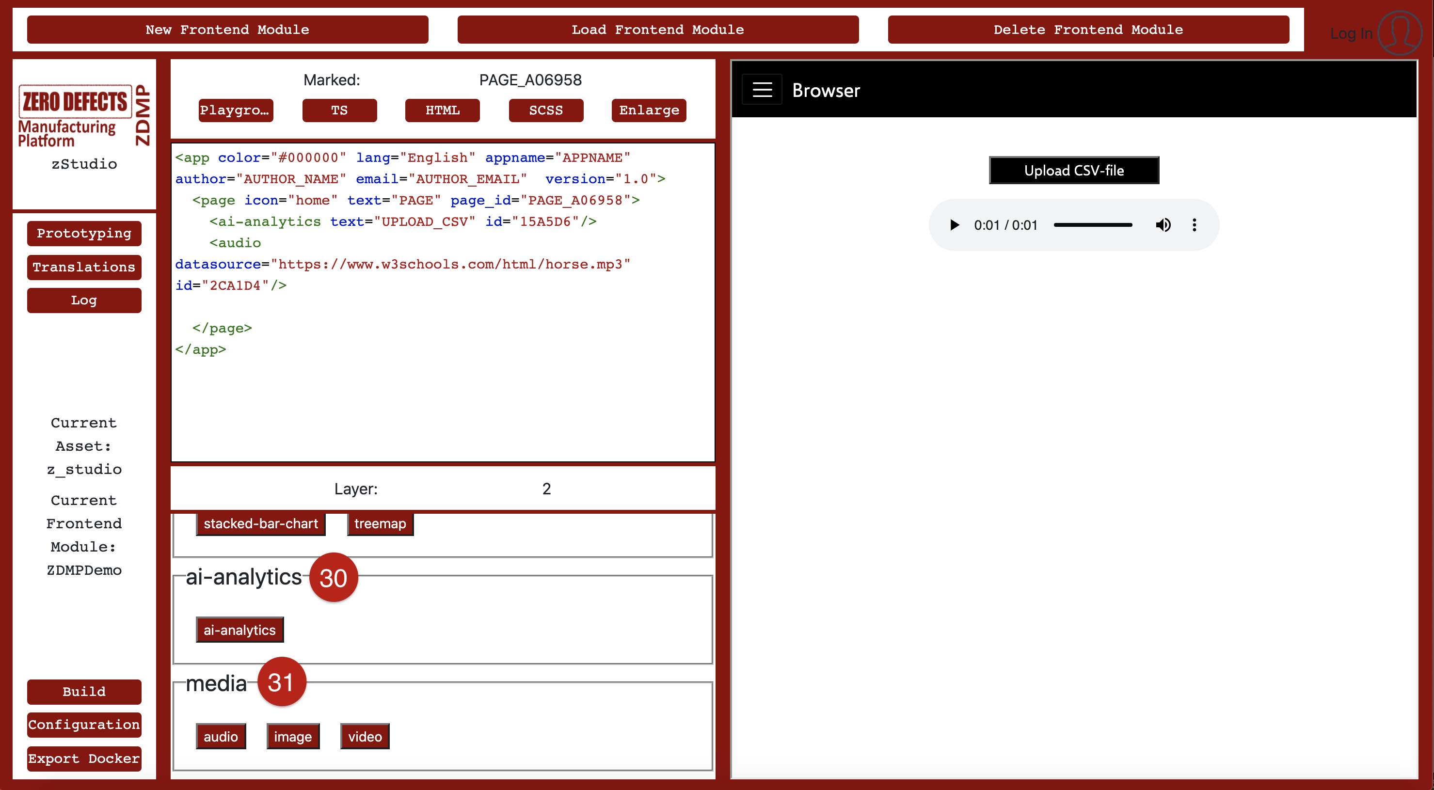
Figure 14: UI elements – AI-Analytics and Media
Panels
For adding different headers of different sizes or writing text in coding style, elements from the panels (32) section can be used. Figure 15 shows a header with the text “Hello world!” in the zApp which has already been added by clicking on the ‘header 1’ button from panels.
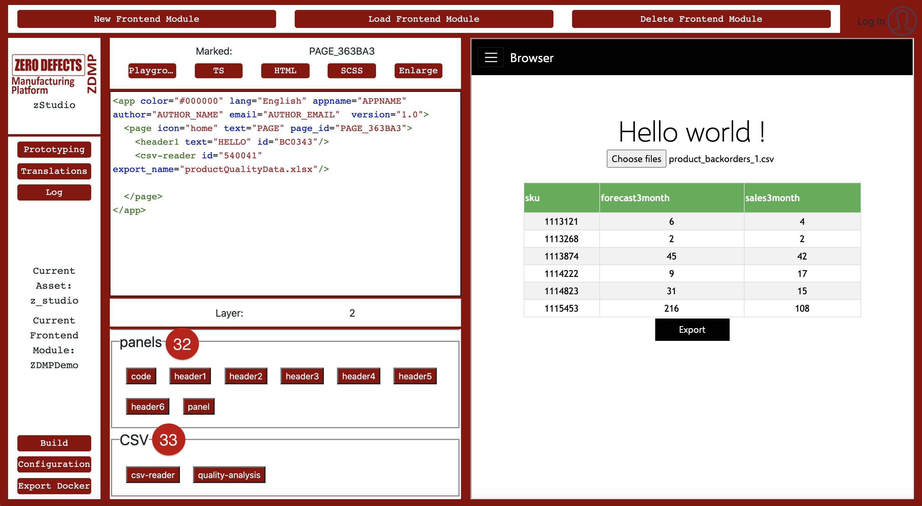
Figure 15: UI elements – panels and CSV
CSV
The CSV (33) section includes two UI elements named “csv-reader” and “quality-analysis”. The CSV reader is used to upload CSV data, after which it reads the data and displays it in form of a table (Figure 15). The element analyses the quality of data using the AI-analytics component and displays the result in the form of a graph. The quality analysis element also allows users to export a CSV file based on the results of the analysis. As always, this prototypical use of data is a starting point for developers who can use the same approach to build more complex use cases.
Logs
The logs (34) are used to log messages and errors on the console (Figure 16). It can also be used for sending error reports to the developers.
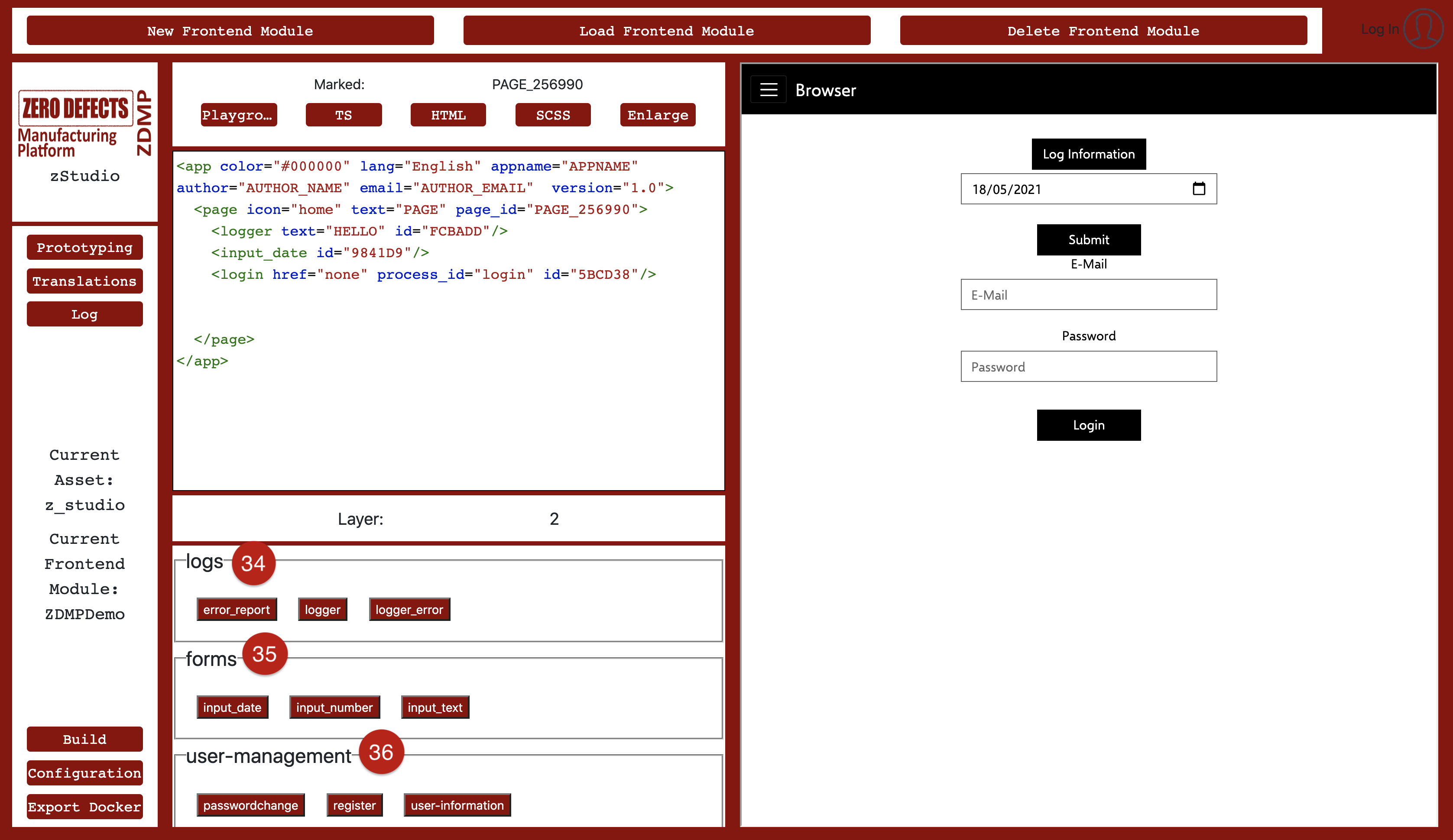
Figure 16: UI elements – logs, forms, and user-management
Forms
The forms (35) section provides different form controls to add date-, number- and text-typed information with a submit form button. Figure 16 shows a ‘input date’ form control added to the page which can be seen under ‘log Information’. A user can select the date and submit the form using this control.
User management
The UI elements in the user-management (36) section are used to register a user with ZDMP, login the user, change the password and get information of the user who is logged in. All the controls in this section can be added only once in each zApp, and that is the reason the login control cannot be seen in this section, as it is already added to the page once before (Figure 16). After logging in, the user’s information is verified using the Secure Authorization and Authentication component so that the user can access all other ZDMP components.
Tables
Two types of tables can be added using UI elements available in tables (37) section: Sensor chart error tables and simple tables. The error table takes a ‘process id’ as an input parameter and displays all the errors related to this process in the form of a table. If there are no errors to display, an empty table is shown. The table element takes a JSON data file as an input parameter and displays data as a fixed-height table. Figure 17 shows a table added to the zApp:
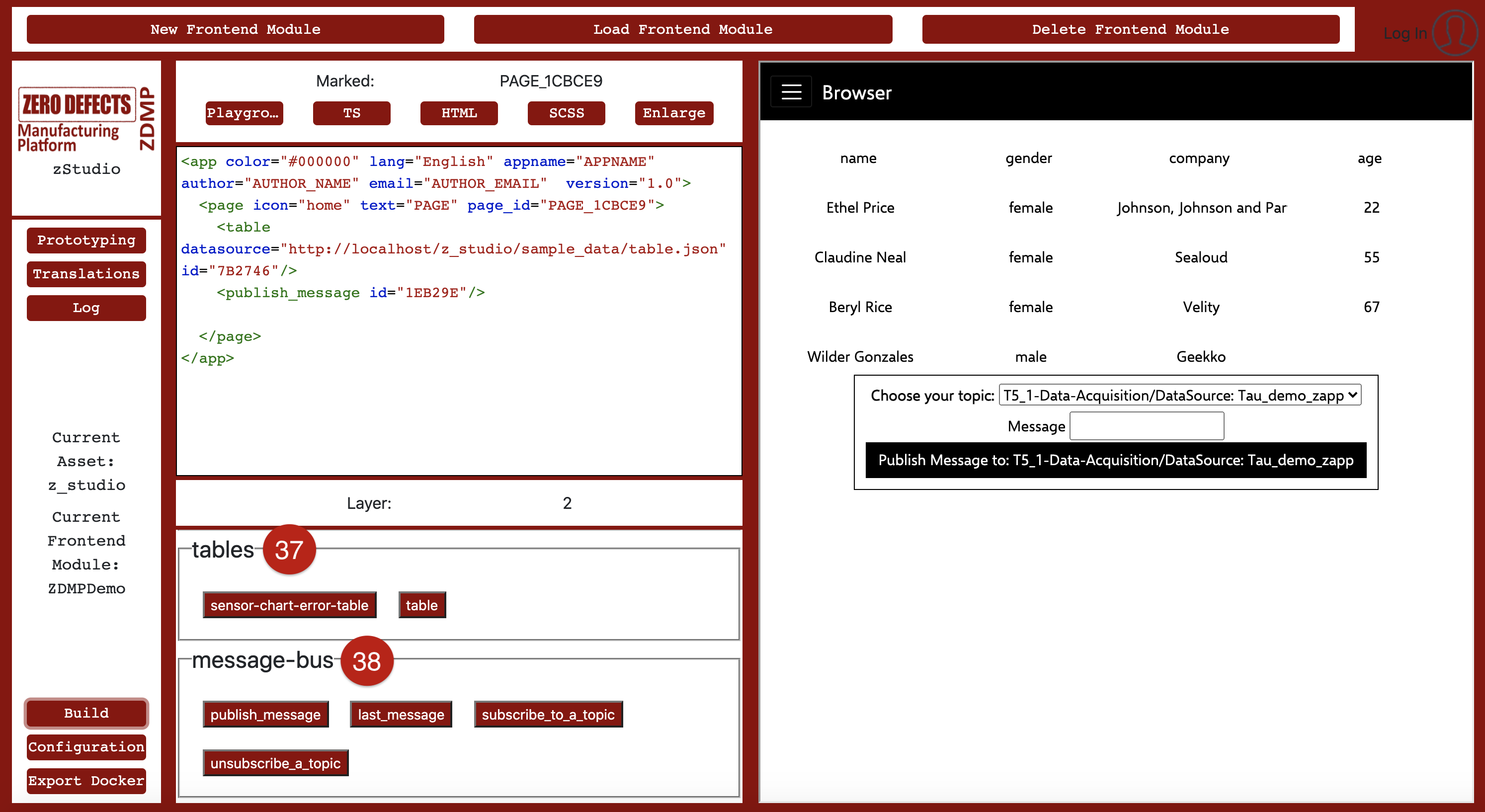
Figure 17: UI elements – tables and message-bus
Message bus
The message-bus (38) allows a user to subscribe or unsubscribe to any topic of the message bus, receive, and send messages to topics and view the incoming messages in the form of a graph or raw data. Figure 17 shows an UI component ‘publish_message’ added to the zApp under the table element. The user has the option to choose a topic, write a message, and publish this message to the message bus.
Monitoring and alerting
The UI element create_alert (39) in the zStudio enables users to monitor data coming from the message bus. The ‘create_alerts’ element allows a user to enter a topic name and a value to monitor. Users can also provide multiple emails, to which they wish to send alerts in case the value goes out of range.
zStudio simplifies Monitoring and Alerting integration for the user. In the backend, zStudio creates a KPI, a condition and alerts on Monitoring and Alerting component, which, in combination, are used to inform users if a value goes out of range. Figure 18 demonstrates the usage of Monitoring and Alerting in a zApp.
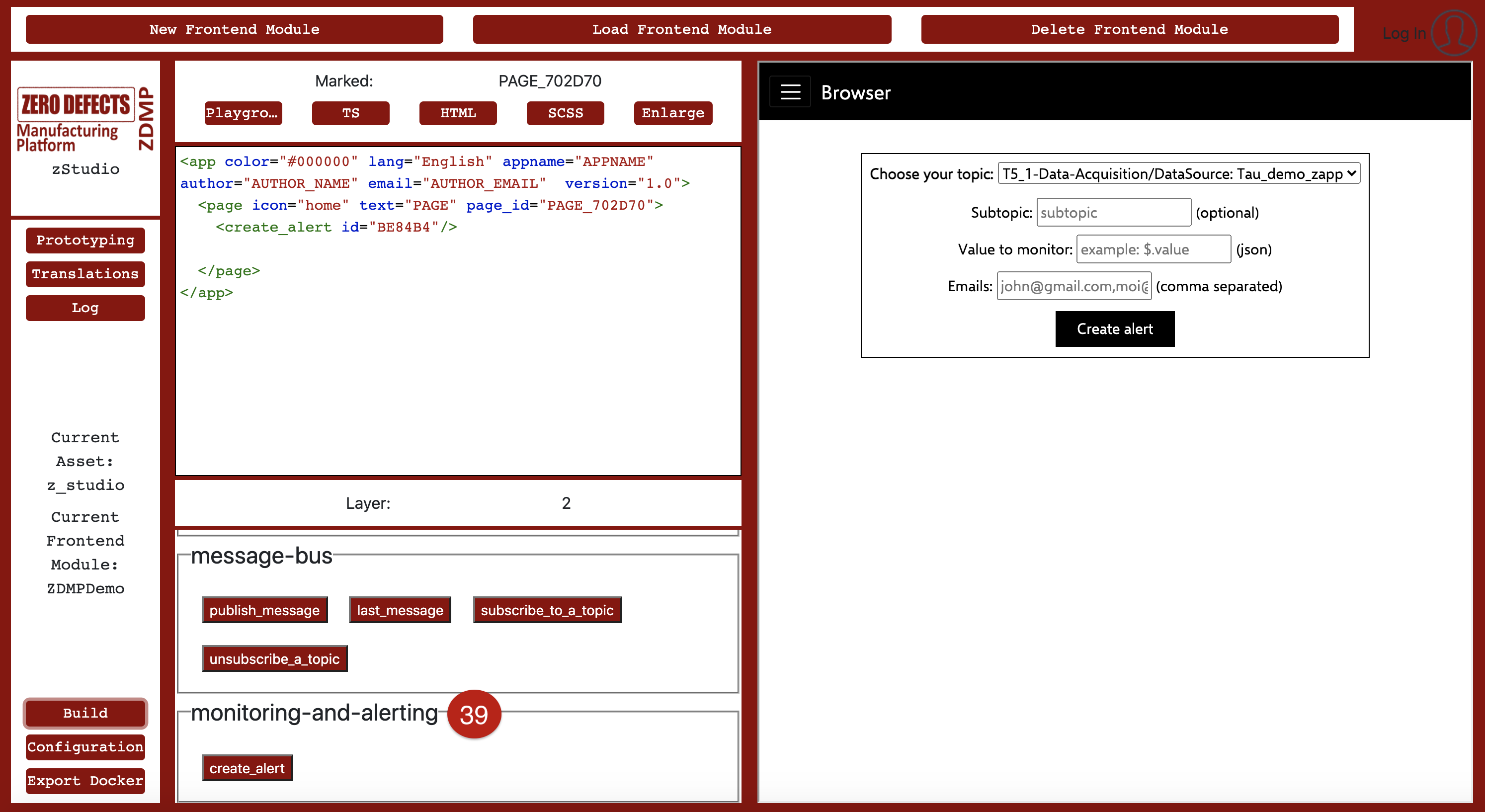
Figure 18: UI elements – monitoring-and-alerting
Example zApp
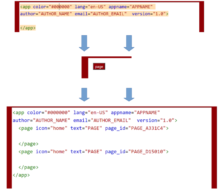
In this section, the development process of a simple example zApp is demonstrated and described in detail. The tutorial starts with naming the zApp appropriately and defining the necessary translations, after which it will go one level deeper into the abstraction. Thus, there are more possibilities to add content and versatility to this newly created zApp. In general, the deeper a template is nested, the more its effective area is local rather than global. See Figure 20 for clarification.
 For this example, it was decided to name our zApp “Hello ZDMP!”. In order to do this, “APPNAME” was marked, the existing translation was overwritten, submitted, and the “build”-button was executed to update the changes to the preview.
After defining the translations, two pages are to be added. To do that, users must click on the page-button to add a <page> tag within the <app> tag. In the layout view, the cursor jumps directly inside the page to enable the next layer. A click outside the <page> tag allows returning back to layer 1, so the steps performed can be repeated to add more pages.
Now, both created pages have the attribute “PAGE”, which is the default value. Clicking at the <page> tag itself, the text can be changed using the translation keys (the same process as was done to “APPNAME” key in the <app> tag). Here, “LOGIN” and “HOME” are chosen.
After adding two pages and executing the “build”-function again, the layout view should look like the last one, but additionally, the clickable preview now should enable to click the menu button and to navigate between both pages with the given names. The pages themselves are currently empty.
As the last step of the zApp creation, all pages can be filled with some content.
In this example (Figure 20), a <login> form is added with an <image> to the “LOGIN”-page. To achieve this, navigate into the first <page> element and click on the <login> template, which is available in layer 2. It should, in the case of a successful login, redirect the user to the second page, “HOME”. For achieving this, select the <login> template and pick the “next page” attribute by choosing the page-id of the “HOME”-page.
The “HOME”-page itself should contain a <historical-sensor-chart>, which is able to represent some historical data measurements frequently updated. The underlying sensor has measured the activity of a machine and has then stored the data, which the user can display from requested timeframes.
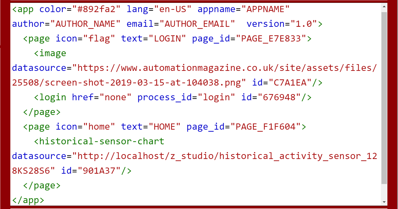
Figure 20: Example Structure of the zApp
After building, the output is shown in Figure 21. If the Login must be tested, insert the registration credentials, and set the forwarding to the “Home” page.
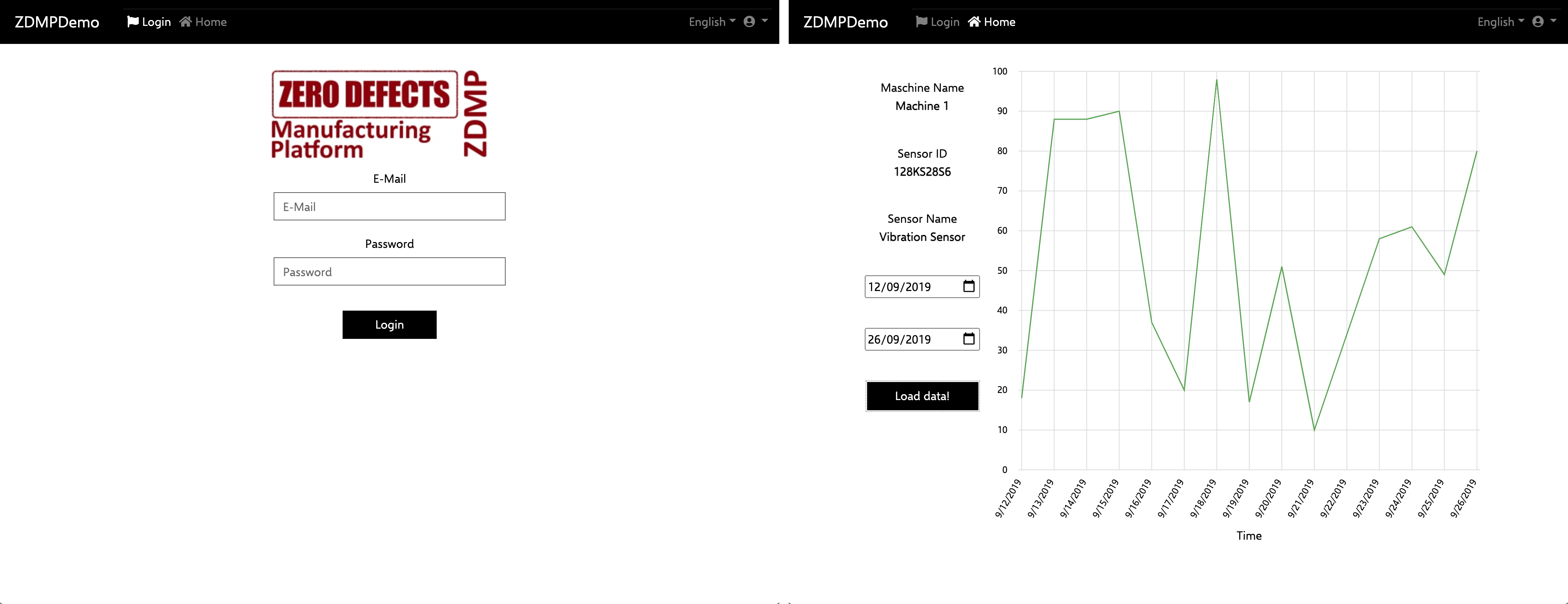
Figure 21: Final Version of a zApp GUI
Code customization
Code customization in the zStudio is based on an XML-based layout structure (17), which is the representation (Figure 22) of the zStudio’s playground (40) and visualizes how to nest custom elements in it to create custom zApps. After each build, finetuning can be performed by manipulating views for TypeScript (41), HTML (42) and SCSS (43).
In these views, developers can add custom code or manipulate code generated by the Application Builder in the playground. For demonstration purposes, the functionality of the <historical-sensor-chart> element is changed, so that the x-axis for the graph with the label “Time” isn’t shown, but “Date” instead, as this is a more suitable description.
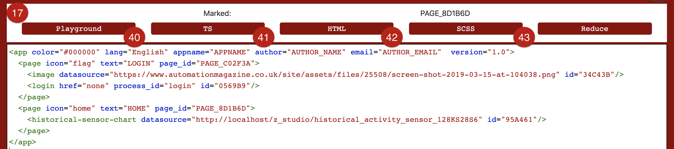
Figure 22: Example XML
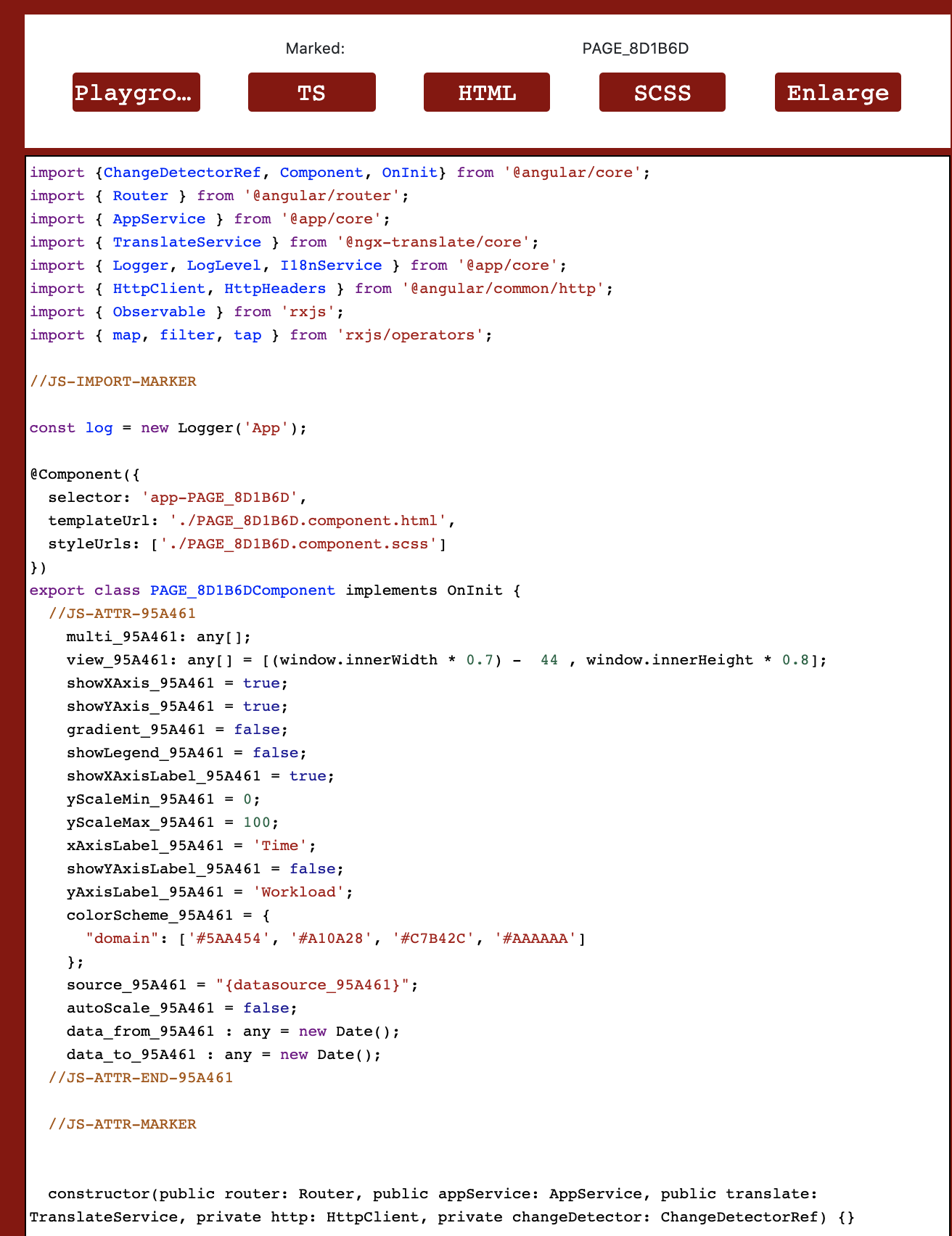
Figure 23: TypeScript-Manipulation for a page
To do this, a user needs to click the template to manipulate within the playground, eg the <app> template itself or one of its pages. If a developer clicks on one of the pages’ child elements, such as <historical-sensor-chart>, the TypeScript view display the source code of the whole <page>. Figure 23 shows the <page> marked with <historical-sensor-chart> template in it. Users can always check the current page in (17).
Following the example in Figure 23 where the second page has been marked with the ID 8D1B6D, containing the <sensor-chart> with ID 95A461. Multiple types of comments are displayed. The following option are available:
Add attributes or variables between JS-ATTR-<ID> and JS-ATTR-END-<ID> for the corresponding template code
Add method calls directly on initialization between JS-INIT-<ID> and JS-INIT-END-<ID> for the corresponding template code
Add method calls directly on initialization between JS-FNKT-<ID> and JS-FNKT-END-<ID> for the corresponding template code
Add attributes, methods, or anything else independently from everything else outside the mentioned comments. The same behaviour is present for HTML: Everything related to certain templates is generated between <!–HTML-ELEM-<ID>–> and <!–HTML-ELEM-END-<ID>–>. Reaching the goal of changing the label of the x-axis of the graph, search for the parameter xAxisLabel_<ID> and replace ‘Time’ by ‘Date’. After building, the changes will be visible in the preview
The updated chart can be seen in Figure 24:
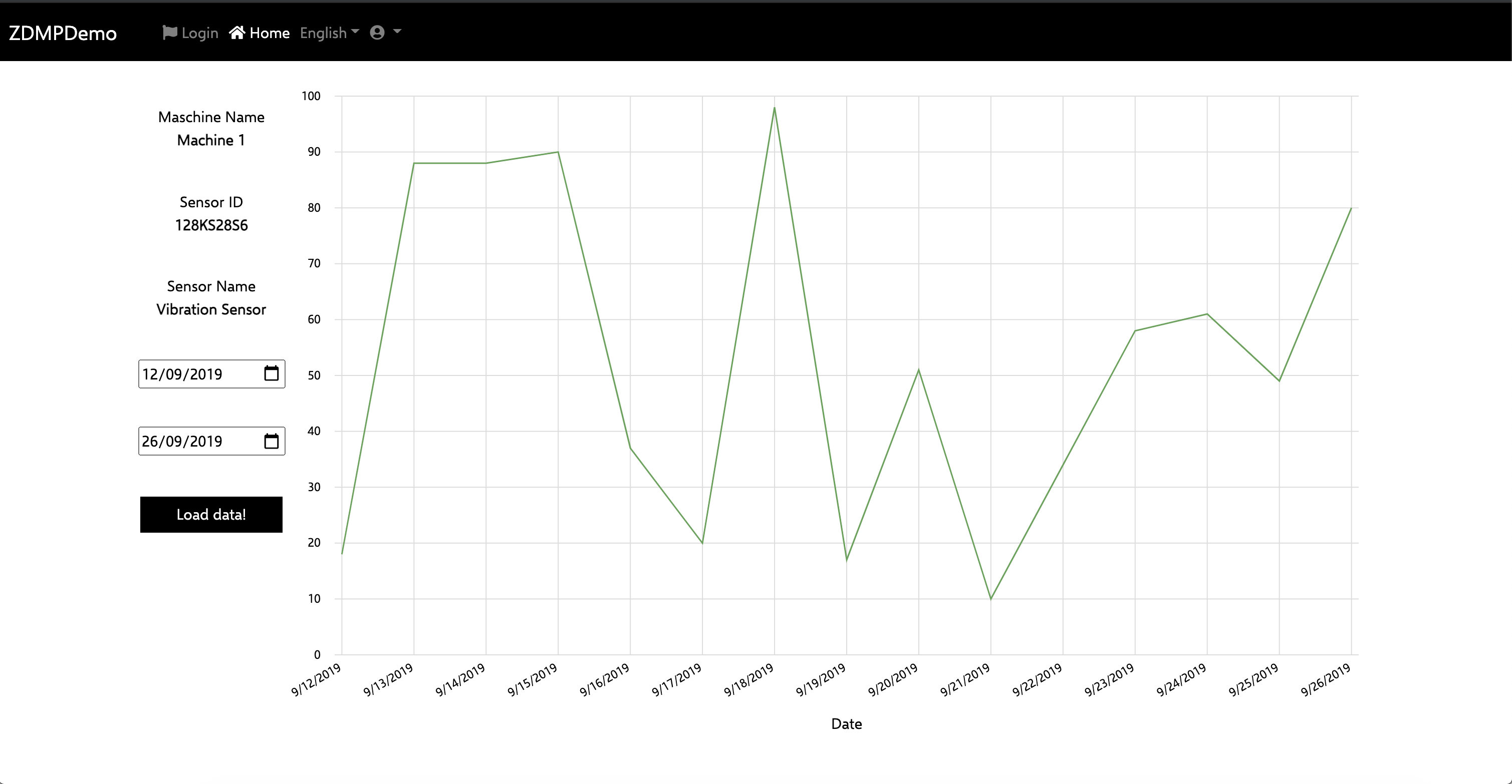
Figure 24: Updated x-axis
Where to find the finished zApp?
The finished zApp contains all the work performed in the ZDMP zStudio as an Angular project. When the zStudio is still running, the zApp can be directly accessed at:
http://localhost/z_studio/<APPNAME>
Elements resizing in a responsive manner as they should, can be tested in the user’s browser.
The zApp itself is located in “%install_directory% t6.1-applications-builder\subsystems\zdmp-application-builder\output\ZDMPDemo\dist”. This is also the data which is sent to the Docker container, if user decides to export it.